Showing posts with label Data Visualization. Show all posts

Sunday, March 12, 2023

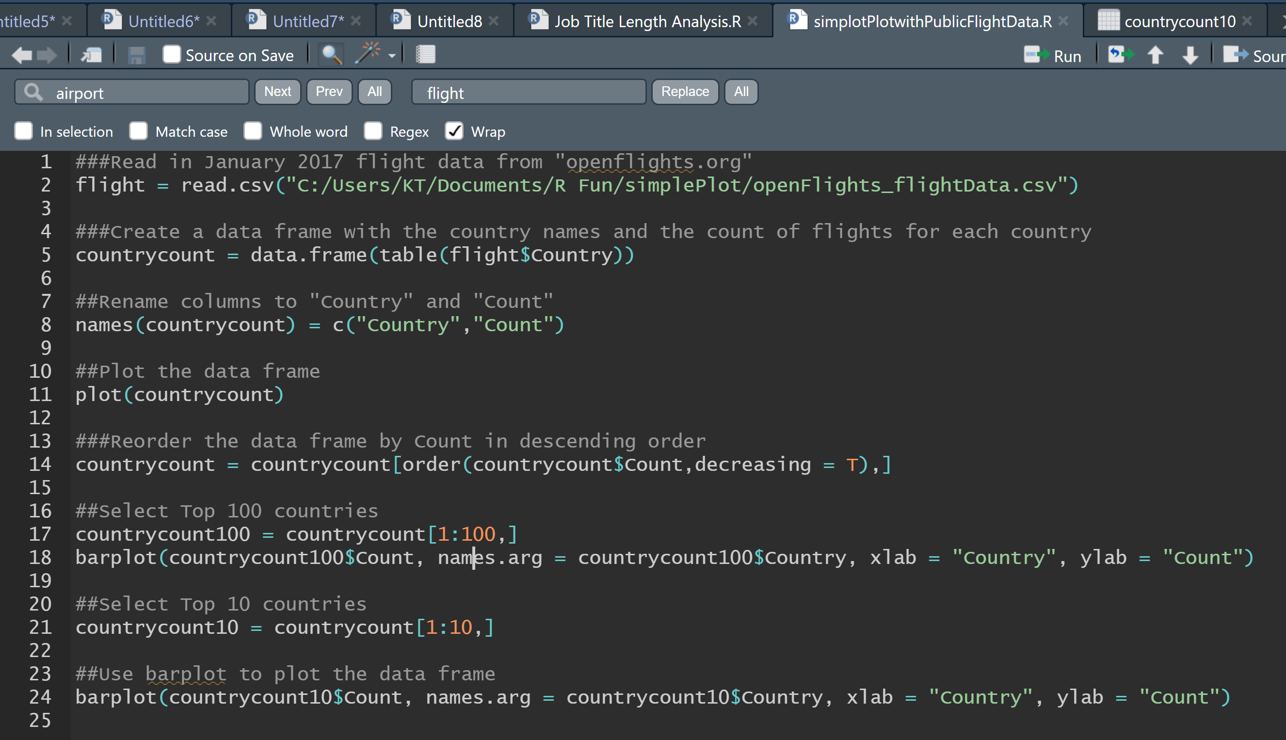
Creating Powerful Visualizations with R - Only 9 Lines of Code

I downloaded international flight data from Openflight.org for January 2017 and created compelling visualizations based on the flight frequency by country using only 9 lines of R code. My goal was to achieve both effectiveness and efficiency in my visualizations.

Raw Data (https://raw.githubusercontent.com/jpatokal/openflights/master/data/airports.dat)


R Code (Only 9 Lines without Comments and Blank Lines)


Plot Based on Raw Data


Bar Plot Based on Top 100 Countries by Flight Frequency (Sorted in Descending Order)


Bar Plot Based on Top 10 Countries by Flight Frequency (Sorted in Descending Order)


Tuesday, March 7, 2023

My YoY CPI Meter

I created a meter visual for the YoY CPI change based on the historical year-over-year (YoY) Consumer Price Index (CPI) measures from 2013-01-01 to 2019-12-31 (Approx. Pre COVID-19 in the US).

https://www.bls.gov/regions/mid-atlantic/data/consumerpriceindexhistorical_us_table.htm

Brian Lee's Video Intro - Apr. 2023

  ** features light background music